

Data storytelling with Tableau.
Data storytelling with Python.
Data storytelling with Excel.
Data storytelling.
I was ranting to my executive coach about not being able to do much data storytelling because I wasn’t able to make enough time to learn Tableau. He looked at me with bafflement.
“Do you want to do data storytelling or do you want to learn Tableau? Because those are entirely different goals.”
That really stopped me dead in my tracks.
From the moment I stumbled onto the MakeoverMonday datasets and community (#datafam), I was hooked. I’ve always looked at information and asked myself: what is the absolute best way to tell the stories this information carries? With MakeoverMonday, datasets were chosen because the original visual didn’t communicate the point as well as it might have. The MakeoverMonday community allowed all tools, but the community overwhelmingly used Tableau, and it was clear why: Tableau was powerful and customisable. Good design principles were baked in; you had to go out of your way to clutter your charts. So what’s the catch? Even with its drag and drop chart-building capabilities, Tableau had a steep learning curve and could be frustrating if you didn’t know what you were doing.
Conversations within the data storytelling community very quickly become more about the tools than the craft of telling stories with data. Tools provide a shared language. Common problems, shareable solutions. Community even. If two people don’t already work on the same projects, talking about the story is trickier. Does the other person have enough context about the domain to understand why this story matters? Besides, there is a definite right answer to when the calculation should have been done at the row level, or the correct sequence in which filters need to be applied for the calculation to be correct.
So I set out to learn Tableau. It was slow going. I always had so much going on: stretch projects, puppy, my hip replacement, other hobbies, family.
I wanted to tell the best story the data could tell, and Tableau kept getting between me and it. I told people: “If I had a Tableau expert at my beck and call, the way an executive does before a board presentation, I’d tell amazing data stories.“
And that is almost, but not entirely true. A good data story, like a good photograph, piques curiosity. The data might show a result or a metric, but it doesn’t necessarily always explain what interesting thing led to the metric. Or, is this sudden change real or is it an artefact of some change in how the data was collected and labelled? So, a good data story needs the data plus domain information. A good data story starts with charts that are supplemented with additional research to finally arrive at insights. A Tableau expert I could direct could get me to the chart, but no further.
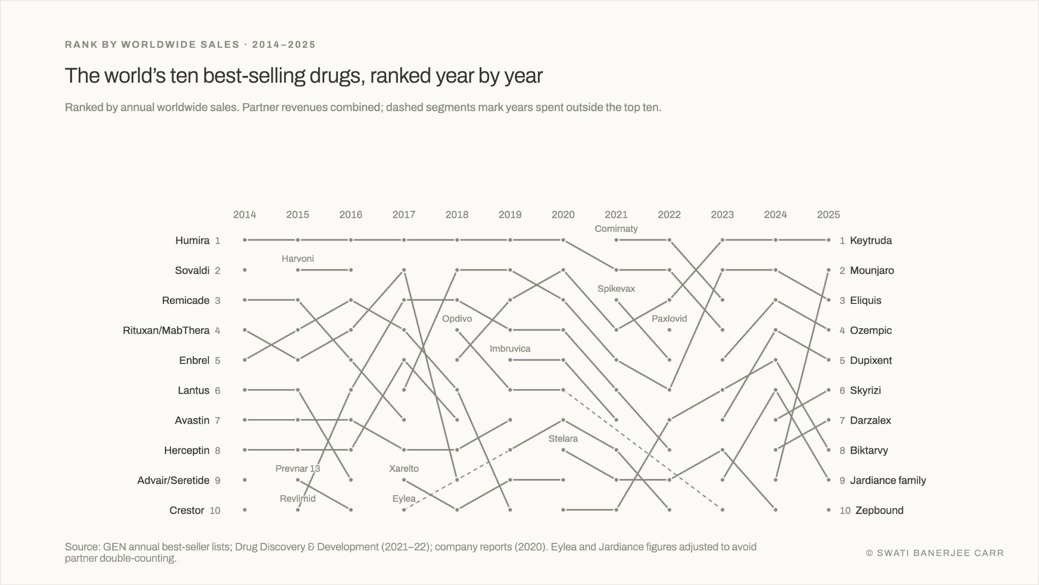
The chart below shows the dataset as is — the top 10 drugs by worldwide sales and nothing more. Which drugs are best sellers and when is interesting, but without discernment, the viewer wouldn’t know what message to take from it beyond saying, “oh that’s interesting!”.
Turns out, I already have that expert: Claude.
Oh. And thinking about it, I need 3 core skills to do data storytelling well using Claude:
Curiosity — the desire to pull on the thread to unravel a story buried within the data
Critical thinking — the ability to evaluate a claim, decide if the data supports it
Discernment — judgement about what matters among several true findings
But did I just replace one tool (Tableau) with another (Claude)?
I’d say absolutely not. Because what I’m getting with Claude is that expert at the tool, but also an encyclopaedia of pertinent information and a very intelligent colleague to pressure test my ideas with. A colleague who once in a while gets something wrong, but I’m there to catch that.
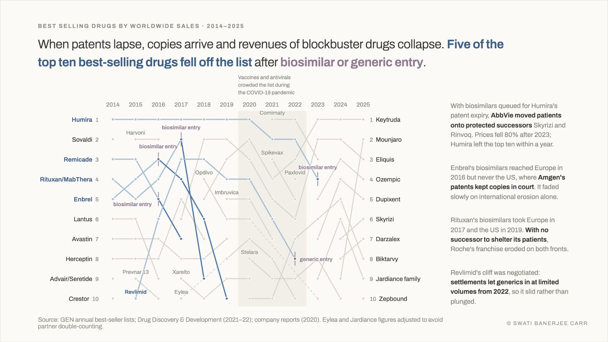
In this version of the same data, I chose to focus on how quickly drugs drop off the blockbuster list once their patent exclusivity runs out. The dataset said nothing about patent cliffs; my curiosity led me to probe why each drug fell, and those answers became the annotations. My critical thinking told me that the 2020–2022 pandemic years, when vaccines and antivirals crowded the list, were an aberration to be marked and set aside rather than a story to tell. And my discernment told me that, of the several true stories in this chart, this was the one worth telling to a diverse audience. The others are for another day’s post.
It’s data storytelling as it should be: focussed on the craft and not the instrument.
Agree. Even as a Tableau expert, the time and technical knowledge it took me to develop the stories I wanted to tell were daunting. It's fun to use AI to bring even my craziest data story ideas to life!